
When a Colour Becomes Language, Power and Symbol
Blue seems universal.
Yet it does not mean the same thing everywhere.
It is not perceived in the same way everywhere.
And above all: it is never neutral.
👉 In Russia, the language distinguishes several blues.
👉 In art, Yves Klein made it an absolute quest.
👉 In business, IBM built a symbolic empire with its nickname Big Blue.
👉 Even the contemporary reliquary of the Crown of Thorns is adorned with a striking blue reminiscent of International Klein Blue.
One colour.
Entire worlds.
In Russian, Blue is Not Just “Blue”
In French, we speak of light blue, dark blue, sky blue.
In Russian, these shades belong to two distinct categories:
- Синий (siniy): dark blue
- Голубой (goluboy): light blue
Research published in the Proceedings of the National Academy of Sciences has shown that this linguistic distinction influences perception: Russian speakers distinguish certain shades of blue more quickly.
📌 Language does not merely describe reality.
It shapes it.
🎨 Klein Blue: An Almost Metaphysical Blue
In the 1950s, Yves Klein sought a blue of unprecedented intensity.
He did not want a simple decorative shade.
He wanted a pure visual experience.
With the help of Parisian colour merchant Édouard Adam, he developed an ultramarine pigment fixed with a synthetic resin that preserved all the depth of the powder. The result was registered in 1960 under the name:
International Klein Blue (IKB)
This blue fascinates because it appears:
- without visible depth
- without limit
- almost immaterial
- spiritual
Klein blue is not a “pretty” blue.
It is a blue that absorbs the gaze.

Yves Klein, “IKB 3, Blue Monochrome” (1960)
Pure pigment and synthetic resin on canvas mounted on wood, 199 x 153 cm
© Succession Yves Klein c/o Adagp Paris
© Centre Pompidou
✝️ The Blue of the Crown of Thorns Reliquary
At the contemporary presentation of the reliquary housing the Crown of Thorns, many were struck by the presence of a deep, luminous, almost saturated blue.
A blue that immediately evokes the world of Klein.
Why does this choice make such an impression?
Because this type of blue instinctively conjures up:
- the sacred
- infinity
- transcendence
- silence
- spiritual verticality
This is no coincidence.
Since the Middle Ages, blue has been associated with celestial royalty, the Virgin’s mantle, divine light. With Klein, it became modern. With the reliquary, it becomes mystical once more.
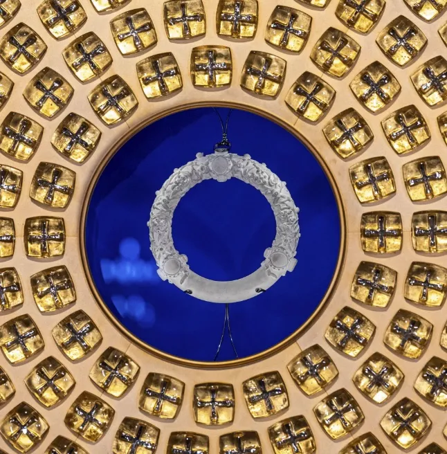
Reliquary of the Holy Crown of Thorns.
Blue has crossed the centuries without losing its power.
🏢 IBM: When Blue Becomes Global Authority
IBM: when a company sought to claim blue for itself
In the twentieth century, IBM became world-famous under the nickname Big Blue.
At first, this name naturally arose from its large dark blue computers, its visual identity, and its dominant presence in the technology market.
But the story goes further.
IBM sought to legally secure the association between its brand and the word Blue, as well as to protect the use of certain shades of blue in fields related to its business.
In other words:
👉 not only to use blue
👉 but to try to symbolically reserve ownership of it in the public mind
That is where the real controversy lies.
Because a colour belongs to everyone.
The sky is blue.
The sea is blue.
The history of art is blue.
And yet, in the logic of modern brands, a company can attempt to turn a universal asset into private property.
IBM, of course, never “owned” blue in the absolute sense.
But the ambition was clear:
- to make blue a mental reflex for IBM
- to make “Blue” inseparable from its technological power
- to symbolically privatise a universal colour
Where Yves Klein sought to elevate blue, IBM sought to capitalise on it.
Two worldviews:
🎨 art elevates a colour
💼 the brand captures its value
And that is precisely what makes this story so fascinating.
👉 Blue imposes itself.
🔗 From Reliquary to IBM: The Same Symbolic Power
It may seem bold to compare the Crown of Thorns and IBM.
And yet.
In both cases, blue is used to produce an immediate effect:
- legitimacy
- stature
- respect
- gravity
- trust
The sacred uses colour.
So do brands.
Religious institutions have known this for a thousand years. Multinationals for only about a hundred.
What This Says About Translation
At ALPIS, we see it every day:
A word is never alone.
Nor is a colour.
Translating a message also means translating:
- its implicit references
- its cultural codes
- its visual symbols
- its emotional impact
Blue does not “say” the same thing everywhere.
Nor do words.
Sources
- Winawer et al., Russian blues reveal effects of language on colour discrimination, PNAS, 2007
- Yves Klein Archives / Yves Klein Foundation
- INPI: International Klein Blue registration, 1960
- IBM brand history / “Big Blue” visual identity
- Heritage documentation on the presentation of the Crown of Thorns at Notre-Dame de Paris